


Between painting just about the entire interior of the two homes we’ve owned so far, you could say I’ve spent a fair amount of time studying paint swatches and experiencing them on our walls first-hand.
I’ve only ever used Benjamin Moore (BM) and Sherwin Williams (SW) and like them equally for the most part but tend to prefer Benjamin Moore. Something about their paint formulas just seems to go on smoother and more of my favorite colors just so happen to be BM.
The other huge thing I’ve learned is that it’s not just about how it looks on the swatch. The exposure of your home can make a huge difference so it’s especially important to pay attention to undertones and how the color can be affected by the position of your home and how many windows or natural light sources are in each room.
Our first house was an East / West exposure so we had tons of natural light and were pretty safe with whatever colors we liked. We had really, really dark brown espresso floors and a modern contemporary black and white kitchen.
With those bold tones, we played on the sharp contrast by choosing about 50 shades of gray throughout the home. (ha) I avoided warm tones because the home didn’t naturally feel ‘warm’ and with the amount of light we received, they could have easily felt yellow or too warm.
Our second home is a North / South exposure with a lot less natural light. We still have light coming in throughout the day but it’s much softer and indirect. The North-facing front of the house pulls cooler and casts an almost pink undertone thanks to our neighbor’s red brick house across the street. (Not at all knocking, but these are the things that affect your paint colors inside you home!)
The back, South-facing light is warm and inviting and keeps my fiddle leaf fig super happy. So I’ve looked for warmer tones, but again nothing too warm. The paint colors when we first moved in were true beiges and I felt like they dated the house rather than keeping it feeling fresh and modernized like it’s white painted brick exterior.
Basically, all that to say – know your home’s exposure! If you’re not sure, take a trick out of my realtor Dad’s book and pull out the compass app on your phone. Stand looking out of your house and then stand looking toward your backyard. That will tell you your exposure.
Pay attention to what’s around you – lots of trees and greenery? Your paint colors might pull more green. And so on…
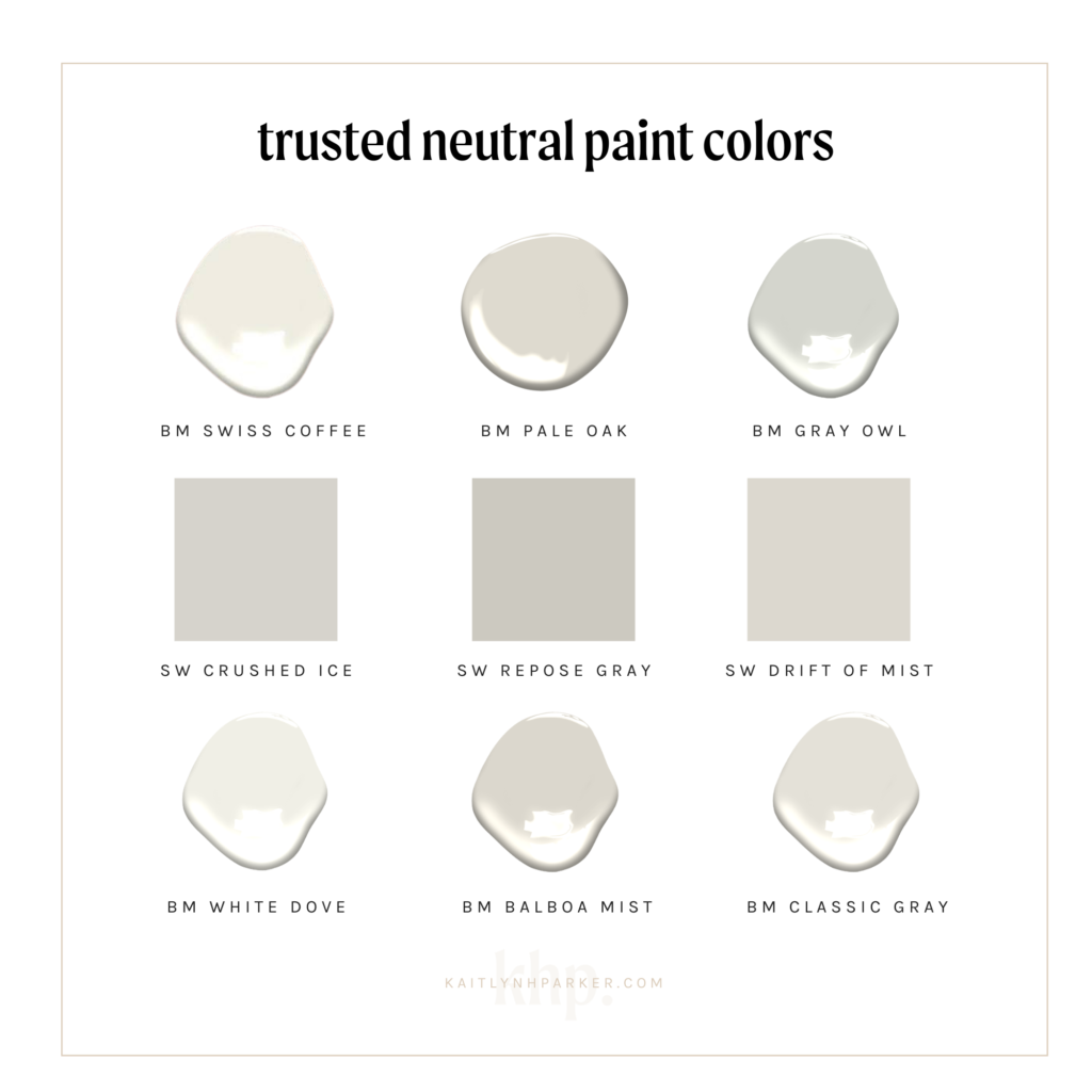
Here are my top 9 trusted neutral paint colors for a modern, transitional home. Some of these were used in our first home and some were used in our second home. Each of them has made my super picky self really happy.
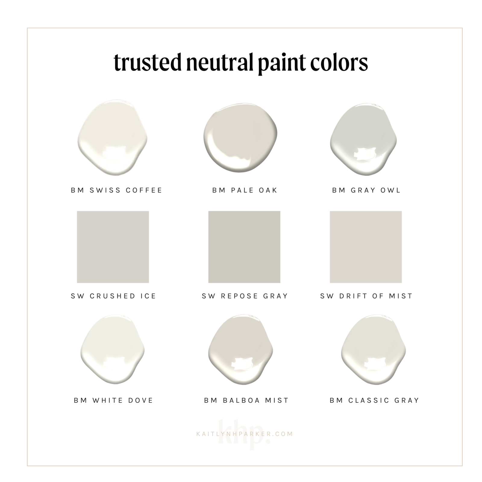
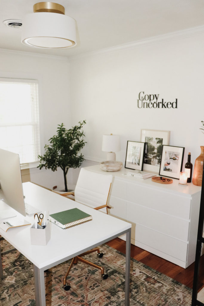
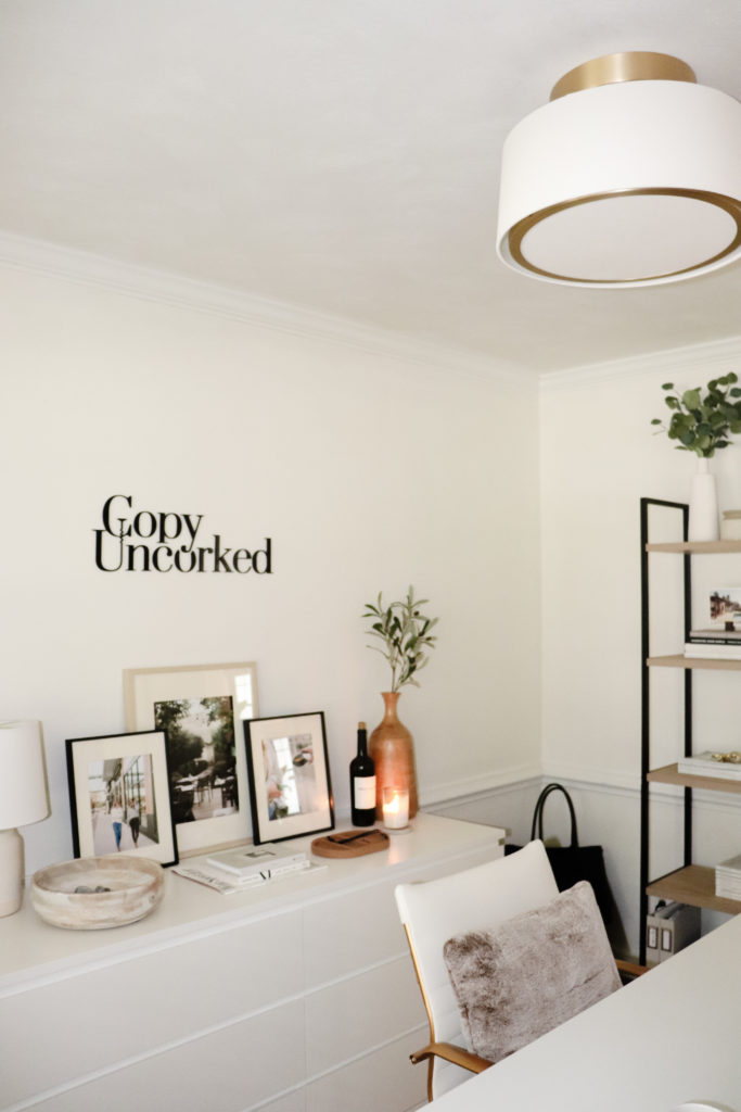
BM Swiss Coffee – This one is a true warmer white but not without feeling too yellow. It almost looks a tad yellow in the second photo, but that’s probably more of my photo editing. Whoops. I love it for my very neutral office to warm up all the stark white furniture and give it a sophisticated, vintage feel. I’ve also seen Studio McGee use it beautifully on kitchen cabinets! I’m thinking about painting our kitchen walls in this color as well.
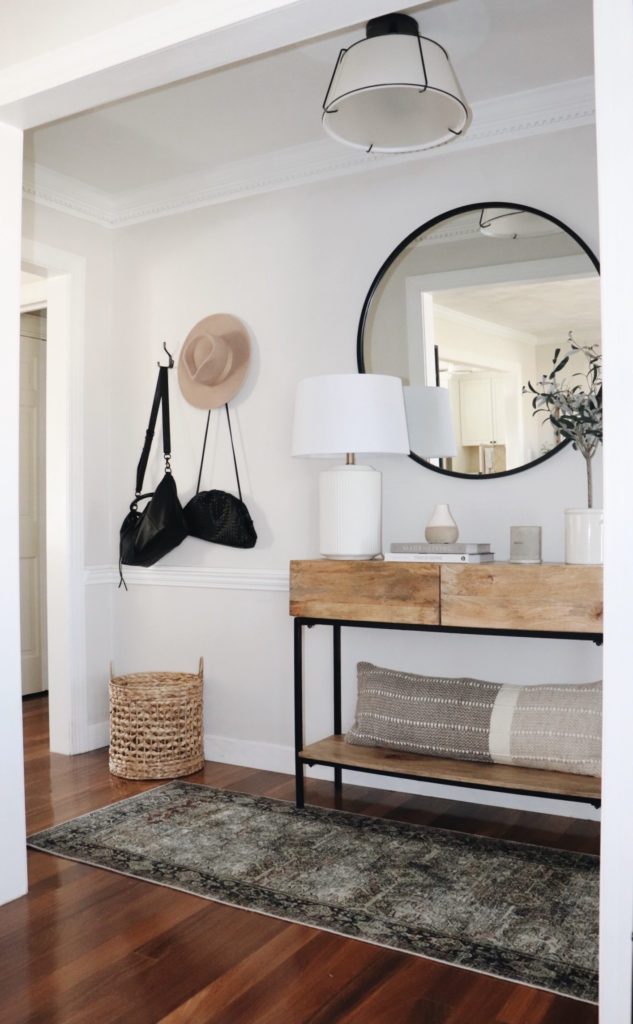
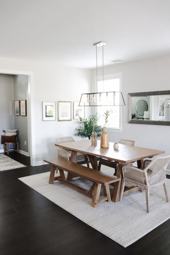
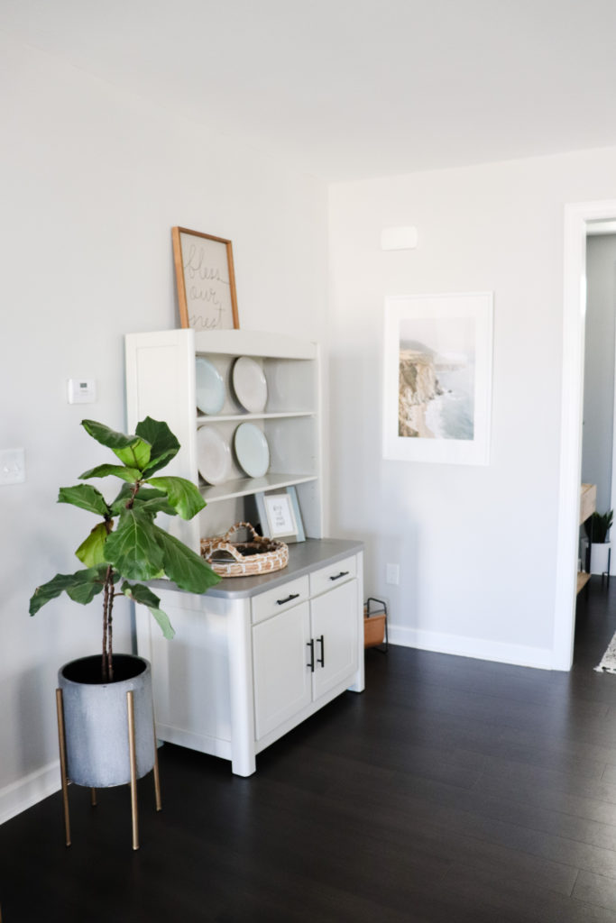
BM Pale Oak – This one I used for the first time in our second home. We’ve used it in the entryway, dining area, and living room – so all of our main, common areas. To me it feels perfectly neutral – not too beige, not too gray, and not too white. It pairs well with our warm wood floors while making our space feel updated. I don’t sense too much of an undertone other than a twingeeeee of pink but I think that’s just me being crazy. (Or the red brick house across the street. ;)) I’ll share more pictures of this one soon!
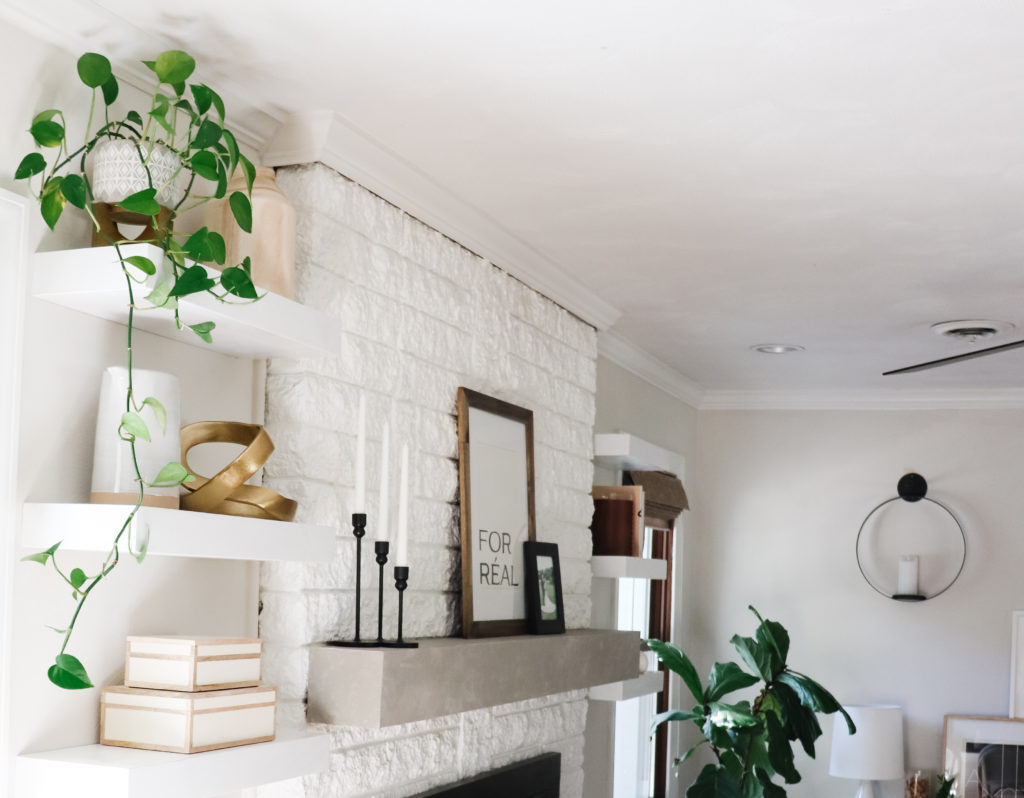
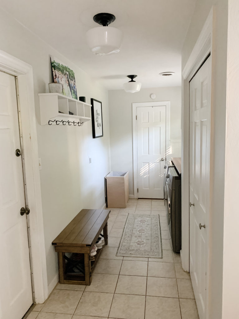
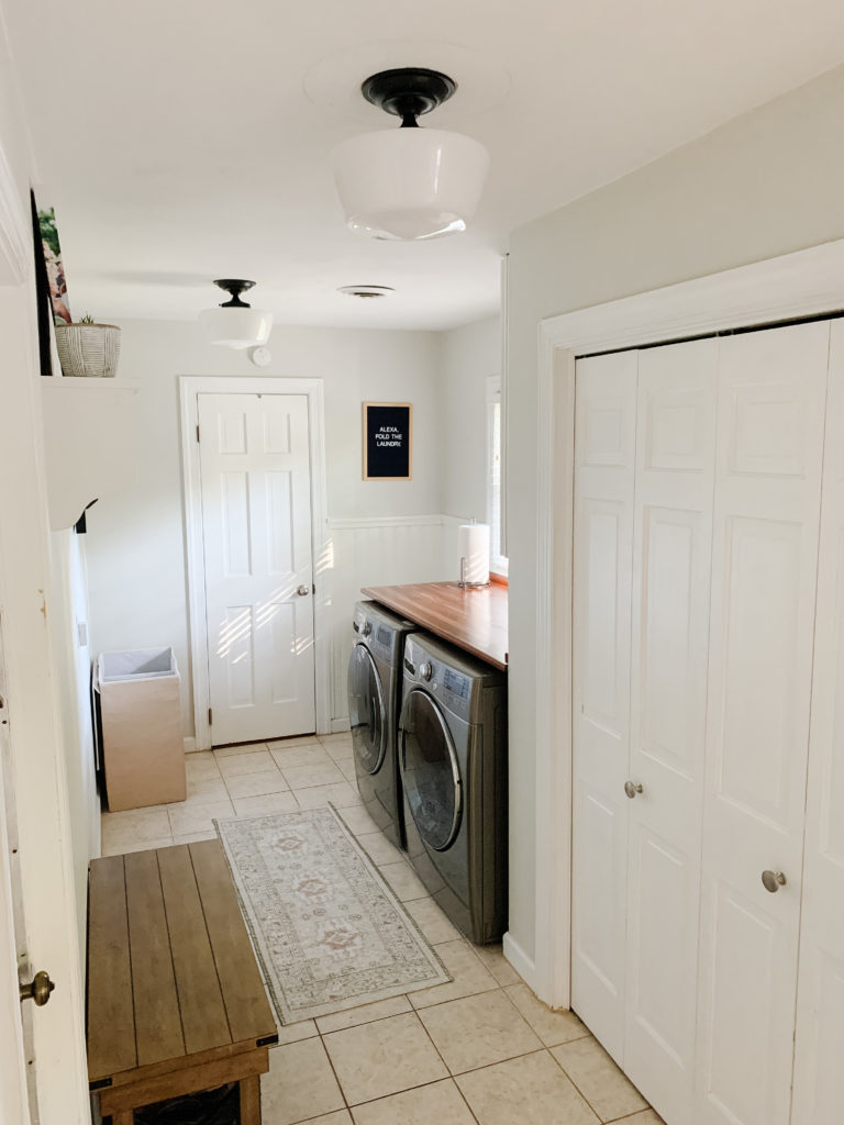
BM Gray Owl – Ahh, Gray Owl, one of my favorites. I personally like a greener undertone because we have lots of plants and neutral furniture. I prefer it to a cooler blue or purple undertone anyday. It keeps things feeling fresh and organic. We actually had it in our Main Bedroom in our first home, and now it’s in the laundry / mudroom, the hallway, and a spare bedroom. I did have it lightened by 25% because we wanted to keep the spaces feeling light since they don’t have a ton of natural light. In our bright bedroom, the full saturation was perfect.
SW Crushed Ice – A friend actually recommended this color to us when we were planning to paint our big, open concept downstairs area in our first house. I just went with it and loved it the whole time we were there. It was definitely on the gray-spectrum but it almost felt white, without being white and I never noticed any purple tones or anything like that. (Remember, lots of Eastern light was pouring in!)
SW Repose Gray – Gosh, this is such a great gray. In my opinion, it has just enough pigment to feel a touch moodier and calming without being dark. In our old kitchen we contrasted the lighter Crushed Ice in the living area by painting the kitchen in Repose Gray. You can kind of see it above the cabinets in the image below. We now have it in our main bedroom (the previous owners picked it! :)) and I love it.
SW Drift of Mist – I’m a big fan of how this one is indeed gray looking but almost brown / taupey instead. I think it would be great when you want warmer but you’re scared of warmer but you hate cool. Basically the paint color paranoia we all have from time to time!
BM White Dove – This is a hugely popular white for BM. I’m still debating between this or Swiss Coffee for our current kitchen. It would also be beautiful in bathrooms, hallways, entryways…a whole home. Definitely white but with a touch of warmth, you really can’t go wrong.
BM Balboa Mist – I almost used this one in the laundry area but just felt like bringing in a twinge of green with Gray Owl. It’s a great modern and transitional gray that would also be gorgeous in a bedroom or main living spaces. Particularly if you have really light oak floors or less depth and orangey / reds like we do!
BM Classic Gray – If you’re torn between white or a neutral gray, this could be your winner. It has just enough pigment to feel interesting without falling flat or commanding too much attention. Undertones may vary based on where you use it. This one does not have a green undertone (so if that’s not your jam, here you go!) butttt it’s also been said to go ever so slightly purple. Just sayin’.
—
I’ll continue to add more images so you can get a better feel for each and know these images have been lightened and edited a bit so they may appear lighter. Paint colors, of course, vary based on shadows, too.
I hope this helped you discover or decide on a paint color you love!
Want to see more paint color picks? Just comment before with what you’re looking more and I’d be happy to share more.
P.S. Want to Shop some of what you see in the images above? Head here.
What color is used on the white trim, chair rail and crown molding in the office photos with Swiss Coffee walls?
Hi there! I didn’t actually repaint the trim, molding, or chair rail (I just left it as is from the previous owner) so I’m not sure! I have touched up the trim in other places in our house and it’s quite a true white. I know that means relaively nothing in a paint store (ha) but it’s more of a ‘ceiling white’ than a softer color of sorts. Sorry I can’t be more helpful!
I loved BM Pale Oak on the color swatch, but was unable to use it in our home. I tested it in our combined dining/living room area (east/west light), as well as one of the hallways. It pulled PURPLE at certain times of the day in the LR/DR (lots of light coming in windows, and yes, the tinge of pink in the hallway, :/
We’re fixing to paint the exterior of our home (brown roof, faces east/west) & am wanting a warm white to set off the beautiful walnut in the front door, garage door & porch columns. I tested BM White Dove & it was too stark on the exterior. (I used it in the main living areas inside; also paired with dark walnut). Navajo White was too dark & seemed to date the exterior. So I’m going to try BM Swiss Coffee next. Wish me luck!